Ready Rebound
Ready Rebound helps HR and Risk leaders manage injury recovery and return-to-work operations across municipalities — turning fragmented, manually-intensive workflows into a unified operational intelligence platform. The goal wasn't a dashboard. The goal was confidence: helping leaders understand what's happening across their caseload, what to do next, and how to report outcomes in a way leadership can trust and act on.
I was brought in as the embedded Principal UX Strategist and product lead — functioning simultaneously as researcher, strategist, and product manager across a 0-to-1 engagement. Concept to validated interactive prototype: research, IA, metric definitions, dashboard design, and a board presentation built on real end-user voices. Not internal assumptions.
Role & Scope
- Role: Principal UX Strategist / Embedded Product Lead
- Scope: End-to-end: research, strategy, IA, dashboard design, metric definitions, component strategy, board presentation
- My work: User research across 9 municipalities, journey mapping, persona development, dashboard architecture, metric definition, stakeholder alignment, board presentation of proof-of-concept
- Users: HR Directors, Risk Managers, Fire and Police Chiefs, Command Staff, Safety Officers, first-responders in recovery
- Partners: CEO, Engineering, AI Engineer, Data — across 8 states
- Methods: A note on method - research synthesis across 9 municipalities and 8 states generated a significant volume of qualitative data from a diverse range of stakeholders — municipal administrators, program coordinators, community partners, and participants with very different contexts and needs. I applied AI-assisted synthesis — using Claude and ChatGPT to compress interview findings, identify pattern clusters, and surface insight themes — reducing what would have been weeks of manual analysis to days. The AI didn't do the design thinking. It removed the processing burden so I could spend more time on the decisions that required a designer: what the patterns meant, what they implied for product direction, and how to present findings in a way that moved a room of municipal leaders to action.
The real problem
Municipal environments combine operational complexity, sensitive data, political dynamics, and legacy system dependencies in ways that make enterprise software feel simple by comparison. HR, Risk, Safety, and Command Staff were operating in isolation — different definitions of success, different data sources, competing priorities. Nobody had a single view of what was happening across their caseload. And without that view, delayed recoveries, hidden liability exposure, and program administrators who couldn't advocate for the resources their teams actually needed were all predictable consequences.
The research revealed something that shaped the entire product direction: administrators didn't just want better data. They wanted to be elevated — to move from reactive task management to strategic program leadership. That reframe changed what we were building. Not a cleaner spreadsheet replacement. A system that gave them the transparency and financial intelligence to lead at the executive level.
- 100% of research participants reported lacking a single source of truth — the core product hypothesis validated immediately
- 9 municipalities across 8 states — each with different policies, workflows, and political realities
- Stakeholders ranging from fire chiefs to HR administrators — each needing different views of the same data
- High sensitivity: injury, recovery, and workers' compensation data at the intersection of HIPAA, legal liability, and employment decisions
- Starting from a high-level feature list — no validated product foundation, board presentation required early
Designing for trust in a high-stakes environment
Return-to-work data sits at the intersection of medical information, legal liability, and employment decisions. The leaders using this system aren't just making operational choices — they're making decisions that affect people's careers, health outcomes, and municipal budgets. Trust in the data isn't a nice-to-have. It's the product.
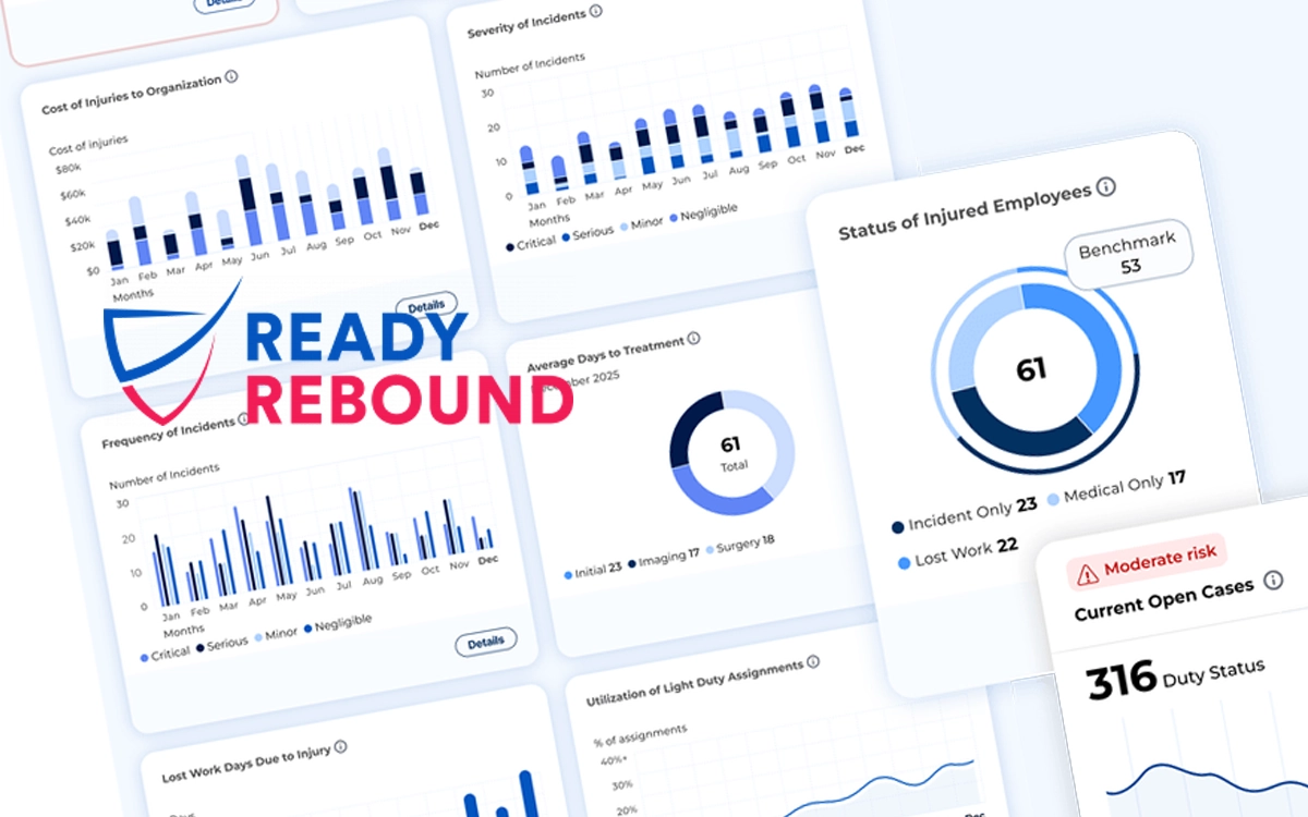
One of the most important contributions was defining defensible metrics — working with product and data teams to establish exactly how each number should be calculated, what it means, and what it doesn't mean. In environments where HR leaders present recovery data to city councils and chiefs testify about staffing decisions, a metric that can't be explained and defended is worse than no metric at all. I defined the calculation logic for every dashboard component before engineering wrote a line of code.
How we got there
I structured the engagement around a single principle: before designing anything, establish what's actually true about how these teams work. Deep research first — then design. Not the other way around.
- Conducted 9 in-depth interviews across municipalities in 8 states — uncovering the real decision points, visibility gaps, and coordination failures driving administrative burden
- Mapped 8 end-to-end user flows across HR, Risk, Safety, Command Staff, and first-responders — journey maps that became the shared reference for all product decisions
- Developed behavioral archetypes that translated qualitative research into actionable design direction — and anchored the board presentation in real user voices
- Defined component-by-component metric and calculation requirements — giving engineering and data the specification clarity to implement accurately
- Collaborated with the AI Engineer to define predictive analytics features: ODG compliance benchmarking, liability prediction, and return-to-work timeline forecasting
- Presented proof-of-concept, research findings, and live prototype directly to the Ready Rebound board — securing buy-in with end-user voices, not internal assumptions
- Built a research and handoff toolkit — journey maps, personas, strategic frameworks — so the incoming VP of Product could inherit a functioning knowledge base, not a blank slate
The work
What it delivered
- 98% of prospective customers rated the concept as highly valuable — validated across 9 municipalities before a line of production code was written
- Board presentation secured executive buy-in using real end-user voices and a live prototype — not a slide deck
- Validated the "Salesforce for municipal recovery" market opportunity, aligning CEO vision with board confidence
- Metric definitions gave engineering and data the specification clarity to implement accurately from day one
- Research and handoff toolkit enabled successful onboarding of incoming VP of Product and Senior AI Engineer
- 100% of participants reported lacking a single source of truth — core product hypothesis confirmed and documented for investors
What this taught me
The most valuable thing I delivered wasn't the prototype — it was the research foundation underneath it. When we presented to the board, we weren't selling a vision. We were presenting what real HR directors, Risk managers, and fire chiefs had told us, in their own words, about the problems they faced every day. That's a different kind of persuasion. It doesn't require belief. It requires recognition.
I also learned something about the limits of the strategist role. My job was to build the foundation and hand it off well — not to see the product through to market. The research toolkit, the metric definitions, the journey maps, the component strategy: all of it was designed to be inherited by a team I'd never meet. Getting that handoff right, so the work could continue without me, was as important as the work itself.
More consulting work
Ready Rebound was a 0-to-1 engagement for a government-facing SaaS product. MoveWare applied similar embedded strategy work in a different domain — wearable tech and operational safety.
View MoveWare → All work →